01 • Newsletter
Join the insiders list
Collect email addresses and Telegram handles for launches, drops, updates, and first access announcements.
BossDude Studios should feel like a real brand, not a pile of experiments. This rebuild turns the site into three clear lanes: Newsletter, Bate Bench, and Store — all under one cleaner visual system.
The site now has obvious navigation, stronger branding hierarchy, and simpler choices so people know exactly where to go next.
Collect email addresses and Telegram handles for launches, drops, updates, and first access announcements.
The exclusive, cheeky section with clearer voice, better imagery, and pages that finally feel connected.
A proper store section with themed drops, stronger product presentation, and a more intentional brand feel.
Black, charcoal, gold, and steel blue. Bigger hero imagery. Cleaner spacing. Stronger masculine tone. Less chaos everywhere.

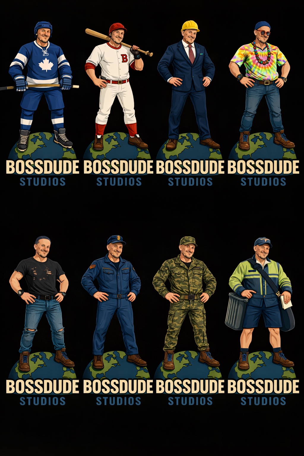
Use fewer paragraphs. Keep the headlines strong. Make each section feel like part of one brand family instead of a bunch of unrelated pages taped together.